Hello
I'm usign a view with Visual composer
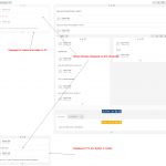
I have 3 columns layout:
The first column is the same as the third columnbut only displayed in mobile
The second columnis displayed all time
The third one is displayed only in PC and bigger size
The modal box is not displayed in this configuration : hidden link
In the standard 2 columns layout, the modal box is displayed : hidden link
My problem is how to display the modal box and be able to show "the offers" on the side and "the form" on the side to be FIRST on mobile sizes ?
Thank you in advance
Sorry, I don't understand - where are the 3 columns? Where is the modal box? Can you show me some screenshots that define each of the columns and the modal box?
Hello,
Please find attached image
Thank you
Okay, it looks like you have a question about a design you've created in Visual Composer. I'm not sure I have the best information about this for you, because we're not Visual Composer specialists here. We integrate with their plugin a bit to help you add Types content to their layout system, but we don't really control their layout system.
I did a quick search for "visual composer responsive layout" and found this post:
hidden link
It looks like they offer some settings that can let you control what appears at different sizes. This might be useful.
Here's a link to their Help Center, where you may find a Knowledge Base article that explains this, or you can contact their Support Team:
hidden link
Let me know if you have questions about how to use Toolset within a Visual Composer design, and I'll be glad to take another look.
Hello
Thank you for tyhe infos, My problem is not really with mobile device or visual composer but why the modal windows is not displayed when you click on details button :
hidden link
Thank you
Okay I'm having trouble understanding why there would be a problem. If possible, can I take a look in your wp-admin area to see how these two posts are configured differently?
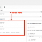
This is the Content Template where the modal does not appear: "Template Offres Privilèges Score 2018 V2". This Content Template is applied to the "Casadelmar – Corse" post. As a test, I made a duplicate of this Content Template, "TS Test". In the duplicated Content Template I deleted the section I have highlighted in the attached screenshot.
After I deleted this section, I temporarily switched the "Casadelmar - Corse" post to use the new TS Test Content Template, and the modal appeared when I clicked the blue button, as expected. So it seems to have something to do with this section, perhaps because there were duplicate Offres on the page, the modal control stopped working? I'm not sure, but that's my guess. There should be only one offres_priv_top shortcode on the page.
You can try this out by applying the TS Test Content Template to the Casadelmar - Corse post, and checking the modal trigger. Let me know if this works or if I have misunderstood something.

